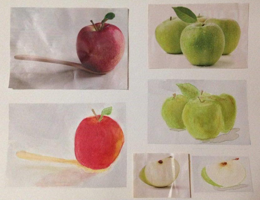
I was flipping through all these free magazines I started getting, I was looking for something to paint. I realized there weren't a lot of 'nature' images in the women's magazines. I found lots of pretty faces, and a hundred different cremes and shirts, but very few larger photos of natural things. I noted a few different ads were using apples, and decided to take a slice at it.
The results were a good study in refraction of light and color, shadow, and trying to 'create' the shape of a sphere.
Even though I liked a lot about my finished product, I noted things I need to develop-- I need to review where my highlights are BEFORE I paint. I need to work my shadows and background colors first - not sure why I haven't gotten in this habit yet. And, I need to be willing to get dark -- my apple gets very red, but I need to add more purple where there is almost no light hitting the apple, to give the proper saturation and hue on the dark side of the apple..
This exercise really made me work to move my shading/layers to keep a spherical curve with changing values. I adore my apple slice, but as I wasn't having to deal with reflection or 'roundness', the apple slice wasn't the challenge of the others.
Michael refused to be outdone though - his apples were much more photogenic as he pushed the saturation levels much higher. He also has a better feel for the shadows created by the image - mine were an after thought. My only critique of his work was his little apple and that he only used a few layers to get all his color on at once , though this is what makes the color pop in the photo. He also did his without sketching first - impressive on its own!
So, in trying out some different techniques, I created some really pretty images. I decided to cut them down and add a sentiment to give to some friends.
This was done with a red to yellow wash. I added the tree after, so had to lift off some color and fill in with the brown. The bottom layer of brown was done when the red was still damp, the tree and front earth was applied on dry paper with little water used.
This was done with a very wet blue gradient wash, then lifted off with a crumpled paper towel.
If you have any artwork that shows off a technique that you think simply created a beautiful or fun image, please share a link or image of it!
So at Oak Creek, a realization came over me. 'Crap, I'm over 8 years old and blue streaks for water just doesn't cut it.' So, I took a little trip to the little local park with a little lake. In the wind, I attempted some basic ripply water. Although still a very amature product, I felt relaxed by the water and more confident that my water skills can and will improve.
Check out Michael's presentation of my painting session - his descriptions tend to be over the top but it's fun:
Things I learned:
Painting in the wind --
Pack binder clips if not taping your artwork down.
Even in Arizona, bring a jacket - or steal your friend's --thanks Michael!
Bring a pony tail holder unless you want to paint with your hair.
Painting water:
Transparency is all about what reflects versus what comes through. Water can act as a perfect mirror, or be so clear as to let you see only the colors coming from beneath. It is all about how much light is coming down, from what angle, and your viewpoint of the water.
With so much light hitting the surface, I noted the little lake was almost entirely reflecting - I couldn't see through the water while sitting on a bench. Just the ground and sky above it shone off the surface. The wind caused a shimmer to the surface, with ripples distorting the reflection, but color wise it was mostly the sky grey blue and sun-bleach white, with bits of the taller trees casting shadowy greens.
The unique thing about water as a mirror is it darkens and diffuses the edges and colors of what it reflects. Depending on the water clarity - in this case, a dark mossy green to the blue grey sky, it can be almost a black shadow. I took some liberty in my painting, to be sure. and speaking of the painting;
So, on my water, I made the first wash a light blue grey. For the water ripples reflecting just sky, I chose dirty blue/purple with a touch of green to show shadows of the deeper water where the light wasn't shining. I found that the sharper the angle of my brush stroke - the more I got towards vertical, the more 'excited' the wave/ripple. The horizontal the stroke, the calmer the water appeared, Fat dots made the water appear barely moving, while many small lines make the water look like it is rippling back on itself.
After playing with my ripples, I added a dark tone - a blue, purple, or brown - to the greens and browns of the trees near the water's edge. I realize my reflections are romantic, and not as realistic as they could be. They should be much darker, saturated, tighter brush strokes. I still think they turned out pretty.
I added the reflection of the trees in little swishy dots with the tip of a small round brush. I tried to have to try show each ripple's top surface as white, middle being a color, and bottom being darker as it warps up to the next ripple. I blended the dirty blue grey green 'ripples' to fill in around my tree dots, and the excess white made things appear much calmer than they were. Still, this was heads and tales better than my other attempt at water.
Painting sky:
While I like going straight for the big solid objects first thing with my paint, I will try doing my sky wash first from now on, as working around the trees to insert the blue wasn't very fun when trying to throw in some cloudy blues. I really did like the effect of paper towel against wet blue grey paint - the sky wasn't full of puffy clouds, but the lift allowed for the hint of atmosphere without looking kiddish. I still need to find a calmer blue for grey days, though, and I would go dark to light, pulling more cloud shape from the bottom and leaving more light wash sky color at the top.
Painting the rest:
What I realized doing this painting was that I really do NOT like paining man-made items. I barely filled in the white space that was a park bench. I ignored the road and the power lines. No people. No sidewalk. I like trying my hand at nature's variety, and not so much man's straight edge.
I show as a lazy painter here, for a few reasons. First - go ahead, count the trees! A lot more in that photograph, aren't there? This wasn't because I thought it looked better with fewer trees, but because I wanted to get to the water. I had a lot of fun painting the trees - then I promptly got bored and moved on. Poor other trees... because I abbreviated the shrubbery, there was a lot of white space here. Given more time, I would fill in the white space with at least a color wash to suggest something there. The other major lazy no no I can still correct is no shadows. Direct sun, shadowy spots under each tree, shadows touching against the lake and - not a shadow made it on my paper. It's all very 2d and surreal because nothing looks 'attached' or grounded to the, well, the ground. But that may be just a few brush strokes away!
My co-worker had a Beautiful Unicorn Peace sticker from Dunn Bros. coffee on his door at work. On an ill-fated morning, Bill noted something was amiss - and saw his Unicorn sticker was stolen!
An inquire was had, with immediate interrogations of all staff members trying to find the heinous criminal, but sadly, this thief remains at large. Bill spent the rest of his day working, trying to overcome the loss and anger of his sticker, I imagine.
To ease his inner turmoil, I decided to make him a new unicorn - nothing could replace the trusty sticker, but I made something bright and cheerful.
I also got to practice my masking technique - rubber cement.
It was a simple thing really, but the effort was well worth it to try sooth Bill's nerves.
The Stolen Unicorn:
-print out unicorn shape.
-lightly trace unicorn onto water color paper.
-carefully apply rubber cement along outline.
-let fully dry - aka, watch Netflix.
-watercolor at will.
It ended up looking like a bag of Skittles left in the sun, but it should cheer him up!
Michael wanted to also do something for Bill, so I masked a second one and let him unleash his artistry.
And if you see anyone with a Beautiful Unicorn Peace sticker from Dunn Bros. Coffee -- steal it back for Bill!